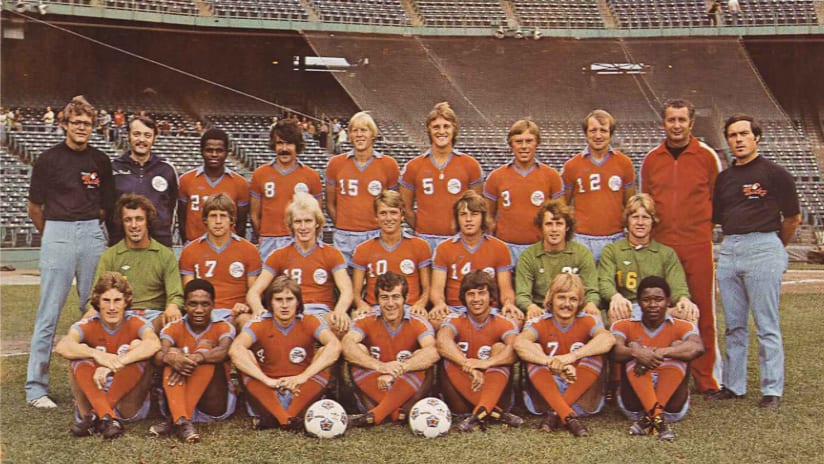
A soccer club’s kit is perhaps the most tangible expression of its identity. A star player or fan favorite might be more visceral or immediate in appeal. The stadium might be more permanent, but it’s also more abstract. Kits, though, represent one of the most intimate attachments a fan can have with a club. The players wear them; you can wear them. They are what you pull from a drawer or a hanger and put on when you cheer. Kits bear colors, badges and — for long-established clubs — history.
The assigning of “colours” to sides in English football dates back to the founding of the “world’s first football club,” Sheffield FC, in 1857, where the club’s rules stated: “Each player must provide himself with a red and dark blue flannel cap, one colour to be worn by each side.” Early in the sport’s history, clubs wore florid and often inconsistent combinations of pink, black and cerise or salmon pink, pale blue and claret. These eventually gave way to simpler patterns of hoops or vertical stripes. Dave Moor of Historical Football Kitstheorizes that as the game’s rules evolved from rugby to involve the forward pass, more distant friendly players ahead of the play were harder to pick out from opponents when dressed in garish, non-standard colors and covered in mud. Sometimes the structure of the game itself dictates changes in the kit.
What began as thick wool jerseys (or “guernseys”) were supplanted by cotton ones. Knickerbockers became shorts, got shorter, then got longer. Plain kits came into fashion because they looked better on TV or better under the bright lights of a stadium at night. Cotton was eventually replaced by synthetic fabrics designed to wick away moisture or keep in body heat. Companies like adidas began to mass produce replicas; teams made third kits, commemorative kits; sponsors won prominent placement on the front of the jersey. Technology and commerce can drive change.
Viewed from a distance, the history of the soccer kit winds between comfort and aesthetics, between practicality and optics. It’s pushed and pulled by the twin demands of the game on the pitch and the desire of supporters to show their pride, to own a piece of the team. If fashion or physics or the game itself dictate a constant re-imagining of the kit, circumstance — an epic championship, a homegrown star, a historic first season — can make a given look legendary.
When Minnesota United begins their inaugural MLS season against the Timbers in Portland on March 3, it will be in brand new kits, but that doesn’t mean there aren’t through lines to the past. The kits will carry elements of their history forward. The badge on the front is the same, the familiar black loon with its deep red eye on a shield of Iron Range grey split by Missisippi blue.
But there will be a new MLS shield on the sleeve in those same blue and grey colors and a new front of jersey sponsor — Minnesota’s own Target — leading the team into Major League Soccer. MLS teams refresh their kits in alternating two-year cycles, staggering changes to the home and away kits so that something is always evolving. It means what you see now will not always be here, but this will always be the first Minnesota United MLS kit.
And so the new Minnesota United kit is a snapshot of a moment in time: the club’s entry into Major League Soccer. But it’s also part of a greater lineage. Fans who show up to matches this season in their vintage MNUFC kits will mix with people clad in the new one. Like a lot of things about this inaugural season, the kit is the start of a new story, but it’s one that doesn’t forget there’s already a history here.


